Templates & Slots
This article explains how you can use the <template> and
<slot> elements to create a flexible template that can
then be used to populate the shadow DOM of a web component.
The <template> Element
The <template> element allows you to declare fragments of the DOM
which are parsed, inserted at page load, and can be activated later at runtime.
Think of a template as a content fragment that is being stored for subsequent use in the document.
While the parser does process the contents of the <template> element while loading the page,
it does so only to ensure that those contents are valid; the element's contents are not rendered, however.
Templates are an ideal placeholder for declaring the structure of a custom element.
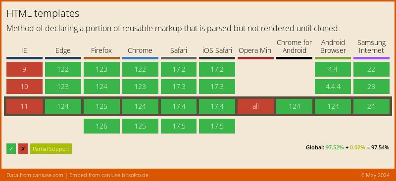
Browser support
Usage without other Web Components technology
HTML templates can of course be used independently. In this simple use case, we use templates to display the same data in different structures and layouts.
See the Pen Show data differently with HTML templates by Joerg Schneider (@byjs-dev) on CodePen.
The versatility of HTML templates
One of the interesting things about templates is that they can contain any HTML. That includes script and style elements. A very simple example would be a template that appends a button that alerts us when it is clicked.
<template id="template">
    <script>
        const tpl_button = document.querySelector('.zep-button');
        tpl_button.addEventListener('click', event => alert(event));
    </script>
    <style>
        .zep-button {
            all: unset;
            background-color: rgb(255, 110, 0);
            border: 0;
            border-radius: 0.25rem;
            color: white;
            font-family: 'Roboto', sans-serif;
            font-size: 1rem;
            padding: .5rem 1rem;
            text-transform: uppercase;
        }
    </style>
    <button class="zep-button">Click me</button>
</template>
See the Pen Simple <template> example by Joerg Schneider (@byjs-dev) on CodePen.
But please don't do it that way in the standard DOM. Why? Because the style tag inside the body is invalid and it's also not scoped to the content of your template, neither is the script. That means everything inside your template will effect the global scope. However, when using the shadow DOM, things are quite different! Then it makes perfect sense because your content is isolated. We'll get to that later...
Shadow DOM composition using slots
Composition is how we construct apps.
Different building blocks (<div>,
<header>,
<form>,
<input>) come together to form them.
Some of these tags even work with each other. Composition is why native elements like <select>,
<details>, <form>,
and <video> are so flexible.
Each of those tags accepts certain HTML as children and does something special with them.
For example, <select>
knows how to render <option> and
<optgroup> into dropdown and multi-select widgets.
Shadow DOM composition introduces a bunch of new fundamentals in web development. Let's standardize on some terminology.
Light DOM
<zep-button>
    <!-- the image and span are zep-button's light DOM -->
    <img src="triangle.svg" alt="A vector graphic showing a triangle" slot="icon">
    <span>Triangle</span>
</zep-button>
Shadow DOM
#shadow-root
    <style>...</style>
    <slot name="icon"></slot>
    <span id="wrapper">
        <slot>Button</slot>
    </span>
Flattened DOM tree
<zep-button>
    #shadow-root
    <style>...</style>
    <slot name="icon">
        <img src="triangle.svg" alt="A vector graphic showing a triangle" slot="icon">
    </slot>
    <span id="wrapper">
        <slot>
            <span>Triangle</span>
        </slot>
    </span>
</zep-button>
The <slot> Element
Slots are placeholders inside your component that users can fill with their own markup.
Elements are allowed to "cross" the shadow DOM boundary when a <slot> invites them in.
Slots don't physically move DOM; they render it at another location inside the shadow DOM.
Slots are a way of creating a "declarative API" for a web component. They mix-in the user's DOM to help render the overall component, thus, composing different DOM trees together. For those of you who remember AngularJS, this is a similar concept to ng-transclude or using props.children in React.
Example with a Tabs component
<zep-tabs> component
#shadow-root
    <div id="tabs">
    <slot id="tabsSlot" name="title"></slot> <!-- named slot -->
    </div>
    <div id="panels">
    <slot id="panelsSlot"></slot>
    </div>
<zep-tabs> like so:
<zep-tabs>
    <button slot="title">Title</button>
    <button slot="title" selected>Title 2</button>
    <button slot="title">Title 3</button>
    <section>content panel 1</section>
    <section>content panel 2</section>
    <section>content panel 3</section>
</zep-tabs>

<!-- Using <h2>'s and changing the ordering would also work! -->
<zep-tabs>
    <h2 slot="title">Title</h2>
    <section>content panel 1</section>
    <h2 slot="title" selected>Title 2</h2>
    <section>content panel 2</section>
    <h2 slot="title">Title 3</h2>
    <section>content panel 3</section>
</zep-tabs>
<zep-tabs>
    #shadow-root
    <div id="tabs">
        <slot id="tabsSlot" name="title">
        <button slot="title">Title</button>
        <button slot="title" selected>Title 2</button>
        <button slot="title">Title 3</button>
        </slot>
    </div>
    <div id="tabs">
        <slot id="panelsSlot">
        <section>content panel 1</section>
        <section>content panel 2</section>
        <section>content panel 3</section>
        </slot>
    </div>
</zep-tabs>
The component is able to handle different configurations,
but the flattened DOM tree remains the same.
We can also switch from <button> to <h2>.
This component was authored to handle different types of children… just like <select> does!
Styling Custom Elements
follow
https://web.dev/shadowdom-v1/#styling
and use
https://zepdev.github.io/web-components-library-gh-pages/?path=/docs/components-zbutton--default
as an example
Custom Elements - Accessibility
to be continued... (pitfalls and how to avoid them -> using slots, form-associated custom elements, etc.)